


提到表单,我们应该很熟悉了,至于在Bootstrap中的表单,如何使用Bootstrap创建表单呢。Bootstrap通过一些简单的HTML 标签和扩展的类即可创建出不同样式的表单,功能比较强大。好吧,继续往下看吧:
忘记说了上节我们谈到内容是:“【Bootstrap第五节】表格”。
Bootstrap提供了三种类型表单布局:垂直表单(默认)、内联表单,水平表单。
垂直或基本表单
基本的表单结构是 Bootstrap 自带的,个别的表单控件自动接收一些全局样式。下面列出了创建基本表单的步骤:
◆ 向父 <form> 元素添加 role="form"。
◆ 把标签和控件放在一个带有 class .form-group 的 <div> 中。这是获取最佳间距所必需的。
◆ 向所有的文本元素 <input>、<textarea> 和 <select> 添加 class .form-control。
先看个案例:
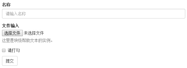
<!DOCTYPE html>
<html>
<head>
    <title>Bootstrap 实例 - 基本表单</title>
    <link rel="stylesheet" href="http://apps.bdimg.com/libs/bootstrap/3.3.0/css/bootstrap.min.css">
    <script src="http://apps.bdimg.com/libs/jquery/2.1.1/jquery.min.js"></script>
    <script src="http://apps.bdimg.com/libs/bootstrap/3.3.0/js/bootstrap.min.js"></script>
</head>
<body>
<form role="form">
    <div class="form-group">
        <label for="name">名称</label>
        <input type="text" class="form-control" id="name" placeholder="请输入名称">
    </div>
    <div class="form-group">
        <label for="inputfile">文件输入</label>
        <input type="file" id="inputfile">
        <p class="help-block">这里是块级帮助文本的实例。</p>
    </div>
    <div class="checkbox">
        <label>
        <input type="checkbox"> 请打勾
        </label>
    </div>
    <button type="submit" class="btn btn-default">提交</button>
</form>
</body>
</html>
结果如下所示:
内联表单
如果需要创建一个表单,它的所有元素是内联的,向左对齐的,标签是并排的,请向 <form> 标签添加 class .form-inline。
结果如下所示:

◆ 默认情况下,Bootstrap 中的 input、select 和 textarea 有 100% 宽度。在使用内联表单时,您需要在表单控件上设置一个宽度。
◆ 使用 class .sr-only,您可以隐藏内联表单的标签。
水平表单
水平表单与其他表单不仅标记的数量上不同,而且表单的呈现形式也不同。如需创建一个水平布局的表单,请按下面的几个步骤进行:
◆ 向父 <form> 元素添加 class .form-horizontal。
◆ 把标签和控件放在一个带有 class .form-group 的 <div> 中。
◆ 向标签添加 class .control-label。
案例如下:
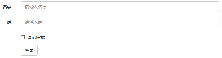
<!DOCTYPE html>
<html>
<head>
   <title>Bootstrap 实例 - 水平表单</title>
   <link rel="stylesheet" href="http://apps.bdimg.com/libs/bootstrap/3.3.0/css/bootstrap.min.css">
   <script src="http://apps.bdimg.com/libs/jquery/2.1.1/jquery.min.js"></script>
   <script src="http://apps.bdimg.com/libs/bootstrap/3.3.0/js/bootstrap.min.js"></script>
</head>
<body>
<form class="form-horizontal" role="form">
    <div class="form-group">
        <label for="firstname" class="col-sm-2 control-label">名字</label>
        <div class="col-sm-10">
            <input type="text" class="form-control" id="firstname" placeholder="请输入名字">
        </div>
    </div>
    <div class="form-group">
        <label for="lastname" class="col-sm-2 control-label">姓</label>
        <div class="col-sm-10">
            <input type="text" class="form-control" id="lastname" placeholder="请输入姓">
        </div>
    </div>
    <div class="form-group">
        <div class="col-sm-offset-2 col-sm-10">
            <div class="checkbox">
            <label>
                <input type="checkbox"> 请记住我
            </label>
            </div>
        </div>
    </div>
    <div class="form-group">
        <div class="col-sm-offset-2 col-sm-10">
            <button type="submit" class="btn btn-default">登录</button>
        </div>
    </div>
</form>
</body>
</html>
结果如下所示:
支持的表单控件
Bootstrap 支持最常见的表单控件,主要是 input、textarea、checkbox、radio 和 select。
输入框(Input)
最常见的表单文本字段是输入框 input。用户可以在其中输入大多数必要的表单数据。Bootstrap 提供了对所有原生的 HTML5 的 input 类型的支持,包括:text、password、datetime、datetime-local、date、month、time、week、number、email、url、search、tel 和 color。适当的 type 声明是必需的,这样才能让 input 获得完整的样式:案例如下:
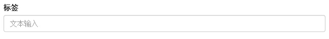
<!DOCTYPE html>
<html>
<head>
   <title>Bootstrap 实例 - 输入框</title>
   <link rel="stylesheet" href="http://apps.bdimg.com/libs/bootstrap/3.3.0/css/bootstrap.min.css">
   <script src="http://apps.bdimg.com/libs/jquery/2.1.1/jquery.min.js"></script>
   <script src="http://apps.bdimg.com/libs/bootstrap/3.3.0/js/bootstrap.min.js"></script>
</head>
<body>
<form role="form">
    <div class="form-group">
        <label for="name">标签</label>
        <input type="text" class="form-control" placeholder="文本输入">
    </div>
</form>
</body>
</html>
结果如下所示:
文本框(Textarea)
当您需要进行多行输入的时,则可以使用文本框 textarea。必要时可以改变 rows 属性(较少的行 = 较小的盒子,较多的行 = 较大的盒子)。
来个例子:
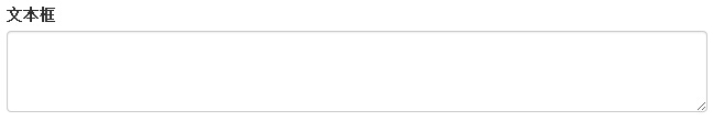
<!DOCTYPE html>
<html>
<head>
    <title>Bootstrap 实例 - 文本框</title>
    <link rel="stylesheet" href="http://apps.bdimg.com/libs/bootstrap/3.3.0/css/bootstrap.min.css">
    <script src="http://apps.bdimg.com/libs/jquery/2.1.1/jquery.min.js"></script>
    <script src="http://apps.bdimg.com/libs/bootstrap/3.3.0/js/bootstrap.min.js"></script>
</head>
<body>
    <form role="form">
        <div class="form-group">
            <label for="name">文本框</label>
            <textarea class="form-control" rows="3"></textarea>
        </div>
    </form>
</body>
</html>
结果如下所示:
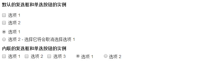
复选框((Checkbox)和单选框(Radio)
◆ 复选框和单选按钮用于让用户从一系列预设置的选项中进行选择。
◆ 当创建表单时,如果您想让用户从列表中选择若干个选项时,请使用 checkbox。如果您限制用户只能选择一个选项,请使用 radio。
对一系列复选框和单选框使用 .checkbox-inline 或 .radio-inline class,控制它们显示在同一行上。
下面的实例演示了这两种类型(默认和内联):
<!DOCTYPE html>
<html>
<head>
    <title>Bootstrap实例-复选框和单选按钮</title>
    <link rel="stylesheet" href="http://apps.bdimg.com/libs/bootstrap/3.3.0/css/bootstrap.min.css">
    <script src="http://apps.bdimg.com/libs/jquery/2.1.1/jquery.min.js"></script>
    <script src="http://apps.bdimg.com/libs/bootstrap/3.3.0/js/bootstrap.min.js"></script>
</head>
<body>
<label for="name">默认的复选框和单选按钮的实例</label>
<div class="checkbox">
    <label><input type="checkbox" value="">选项 1</label>
</div>
<div class="checkbox">
    <label><input type="checkbox" value="">选项 2</label>
</div>
<div class="radio">
    <label><input type="radio" name="optionsRadios" id="optionsRadios1" value="option1" checked> 选项 1 </label>
</div>
<div class="radio">
    <label><input type="radio" name="optionsRadios" id="optionsRadios2" value="option2">选项2-选择它将会取消选择选项1</label>
</div>
    <label for="name">内联的复选框和单选按钮的实例</label>
<div>
    <label class="checkbox-inline"><input type="checkbox" id="inlineCheckbox1" value="option1"> 选项 1 </label>
    <label class="checkbox-inline"><input type="checkbox" id="inlineCheckbox2" value="option2"> 选项 2 </label>
    <label class="checkbox-inline"><input type="checkbox" id="inlineCheckbox3" value="option3"> 选项 3 </label>
    <label class="checkbox-inline"><input type="radio" name="optionsRadiosinline" id="optionsRadios3" value="option1" checked>选项1</label>
    <label class="checkbox-inline"><input type="radio" name="optionsRadiosinline" id="optionsRadios4" value="option2"> 选项2</label>
</div>
</body>
</html>
结果如下所示:
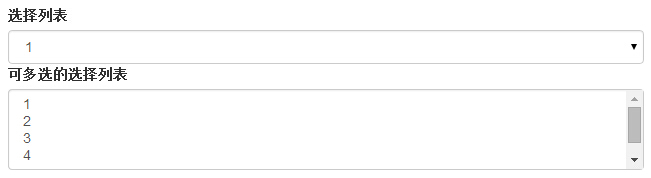
选择框(Select)
当您想让用户从多个选项中进行选择,但是默认情况下只能选择一个选项时,则使用选择框。
◆ 使用 <select> 展示列表选项,通常是那些用户很熟悉的选择列表,比如州或者数字。
◆ 使用 multiple="multiple" 允许用户选择多个选项。
下面的实例演示了这两种类型(select 和 multiple):
<!DOCTYPE html>
<html>
<head>
    <title>Bootstrap实例-选择框</title>
    <link rel="stylesheet" href="http://apps.bdimg.com/libs/bootstrap/3.3.0/css/bootstrap.min.css">
    <script src="http://apps.bdimg.com/libs/jquery/2.1.1/jquery.min.js"></script>
    <script src="http://apps.bdimg.com/libs/bootstrap/3.3.0/js/bootstrap.min.js"></script>
</head>
<body>
<form role="form">
    <div class="form-group">
    <label for="name">选择列表</label>
    <select class="form-control">
        <option>1</option>
        <option>2</option>
        <option>3</option>
        <option>4</option>
        <option>5</option>
    </select>
    <label for="name">可多选的选择列表</label>
    <select multiple class="form-control">
        <option>1</option>
        <option>2</option>
        <option>3</option>
        <option>4</option>
        <option>5</option>
    </select>
    </div>
</form>
</body>
</html>
结果如下所示:
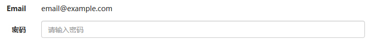
静态控件
当您需要在一个水平表单内的表单标签后放置纯文本时,请在 <p> 上使用 class .form-control-static。
<!DOCTYPE html>
<html>
<head>
    <title>Bootstrap 实例 - 静态控件</title>
    <link rel="stylesheet" href="http://apps.bdimg.com/libs/bootstrap/3.3.0/css/bootstrap.min.css">
    <script src="http://apps.bdimg.com/libs/jquery/2.1.1/jquery.min.js"></script>
    <script src="http://apps.bdimg.com/libs/bootstrap/3.3.0/js/bootstrap.min.js"></script>
</head>
<body>
<form class="form-horizontal" role="form">
    <div class="form-group">
    <label class="col-sm-2 control-label">Email</label>
        <div class="col-sm-10">
            <p class="form-control-static">email@example.com</p>
        </div>
    </div>
    <div class="form-group">
    <label for="inputPassword" class="col-sm-2 control-label">密码</label>
        <div class="col-sm-10">
            <input type="password" class="form-control" id="inputPassword"  placeholder="请输入密码">
        </div>
    </div>
</form>
</body>
</html>
结果如下所示:
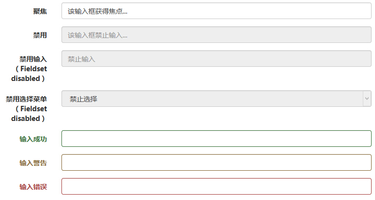
表单控件状态
除了 :focus 状态(即,用户点击 input 或使用 tab 键聚焦到 input 上),Bootstrap 还为禁用的输入框定义了样式,并提供了表单验证的 class。
输入框焦点
当输入框 input 接收到 :focus 时,输入框的轮廓会被移除,同时应用 box-shadow。
禁用的输入框 input
如果您想要禁用一个输入框 input,只需要简单地添加 disabled 属性,这不仅会禁用输入框,还会改变输入框的样式以及当鼠标的指针悬停在元素上时鼠标指针的样式。
禁用的字段集 fieldset
对 <fieldset> 添加 disabled 属性来禁用 <fieldset> 内的所有控件。
验证状态
Bootstrap 包含了错误、警告和成功消息的验证样式。只需要对父元素简单地添加适当的 class(.has-warning、 .has-error 或 .has-success)即可使用验证状态。
下面的实例演示了所有控件状态:
<!DOCTYPE html>
<html>
<head>
    <title>Bootstrap 实例 - 表单控件状态</title>
    <link rel="stylesheet" href="http://apps.bdimg.com/libs/bootstrap/3.3.0/css/bootstrap.min.css">
    <script src="http://apps.bdimg.com/libs/jquery/2.1.1/jquery.min.js"></script>
    <script src="http://apps.bdimg.com/libs/bootstrap/3.3.0/js/bootstrap.min.js"></script>
</head>
<body>
<form class="form-horizontal" role="form">
    <div class="form-group">
        <label class="col-sm-2 control-label">聚焦</label>
        <div class="col-sm-10">
            <input class="form-control" id="focusedInput" type="text" value="该输入框获得焦点...">
        </div>
    </div>
    <div class="form-group">
        <label for="inputPassword" class="col-sm-2 control-label">  禁用  </label>
        <div class="col-sm-10">
            <input class="form-control" id="disabledInput" type="text" placeholder="该输入框禁止输入..." disabled>
        </div>
    </div>
    <fieldset disabled>
        <div class="form-group">
            <label for="disabledTextInput" class="col-sm-2 control-label">  禁用输入(Fieldset disabled) </label>
            <div class="col-sm-10">
                <input type="text" id="disabledTextInput" class="form-control" placeholder="禁止输入">
            </div>
        </div>
        <div class="form-group">
            <label for="disabledSelect" class="col-sm-2 control-label"> 禁用选择菜单(Fieldset disabled) </label>
            <div class="col-sm-10">
                <select id="disabledSelect" class="form-control">
                    <option>禁止选择</option>
                </select>
            </div>
        </div>
    </fieldset>
    <div class="form-group has-success">
        <label class="col-sm-2 control-label" for="inputSuccess"> 输入成功 </label>
        <div class="col-sm-10">
            <input type="text" class="form-control" id="inputSuccess">
        </div>
    </div>
    <div class="form-group has-warning">
        <label class="col-sm-2 control-label" for="inputWarning"> 输入警告 </label>
        <div class="col-sm-10">
            <input type="text" class="form-control" id="inputWarning">
        </div>
    </div>
    <div class="form-group has-error">
        <label class="col-sm-2 control-label" for="inputError"> 输入错误 </label>
        <div class="col-sm-10">
            <input type="text" class="form-control" id="inputError">
        </div>
    </div>
</form>
</body>
</html>
结果如下所示:
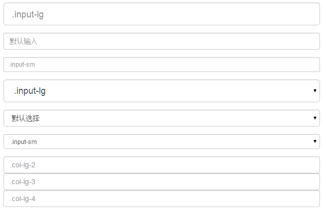
表单控件大小
您可以分别使用 class .input-lg 和 .col-lg-* 来设置表单的高度和宽度。下面的实例演示了这点:
<!DOCTYPE html><html><head>
    <title>Bootstrap 实例 - 表单控件大小</title>
    <link rel="stylesheet" href="http://apps.bdimg.com/libs/bootstrap/3.3.0/css/bootstrap.min.css">
    <script src="http://apps.bdimg.com/libs/jquery/2.1.1/jquery.min.js"></script>
    <script src="http://apps.bdimg.com/libs/bootstrap/3.3.0/js/bootstrap.min.js"></script>
</head>
<body>
<form role="form">
    <div class="form-group">
        <input class="form-control input-lg" type="text" placeholder=".input-lg">
    </div>
    <div class="form-group">
        <input class="form-control" type="text" placeholder="默认输入">
    </div>
    <div class="form-group">
        <input class="form-control input-sm" type="text" placeholder=".input-sm">
    </div>
    <div class="form-group">
    </div>
    <div class="form-group">
        <select class="form-control input-lg">
            <option value="">.input-lg</option>
        </select>
    </div>
    <div class="form-group">
        <select class="form-control">
            <option value="">默认选择</option>
        </select>
    </div>
    <div class="form-group">
        <select class="form-control input-sm">
            <option value="">.input-sm</option>
        </select>
    </div>
    <div class="row">
        <div class="col-lg-2">
            <input type="text" class="form-control" placeholder=".col-lg-2">
        </div>
        <div class="col-lg-3">
            <input type="text" class="form-control" placeholder=".col-lg-3">
        </div>
        <div class="col-lg-4">
            <input type="text" class="form-control" placeholder=".col-lg-4">
        </div>
    </div>
</form>
</body>
</html>
结果如下所示:
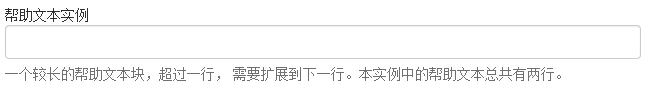
表单帮助文本
Bootstrap 表单控件可以在输入框 input 上有一个块级帮助文本。为了添加一个占用整个宽度的内容块,请在 <input> 后使用 .help-block。下面的实例演示了这点:
<!DOCTYPE html>
<html>
<head>
    <title>Bootstrap 实例 - 表单帮助文本</title>
    <link rel="stylesheet" href="http://apps.bdimg.com/libs/bootstrap/3.3.0/css/bootstrap.min.css">
    <script src="http://apps.bdimg.com/libs/jquery/2.1.1/jquery.min.js"></script>
    <script src="http://apps.bdimg.com/libs/bootstrap/3.3.0/js/bootstrap.min.js"></script>
</head>
<body>
<form role="form">
    <span>帮助文本实例</span>
    <input class="form-control" type="text" placeholder="">
    <span class="help-block">一个较长的帮助文本块,超过一行,需要扩展到下一行。本实例中的帮助文本总共有两行。</span>
</form>
</body>
</html>
结果如下所示:
好吧,就先介绍到这里,下一节就介绍“第七节 - 按钮”,敬请期待。
 Bootstrap教程|Bootstrap3.0表单[6]
 网页设计中如何设计字体
 CSS教程|DIV+CSS中的常见错误